Gradient Web 2.0 Effects with GIMP
In my last post, I mentioned that I installed GIMP to read a Photoshop .psd file. If you’re not familiar with GIMP, it is an extremely high quality free alternative to Photoshop. Using GIMP, I have been able to create several graphical effects with little effort. In this post, I will show you how I created the logos for Lumidant and Moon Rock Media using GIMP.
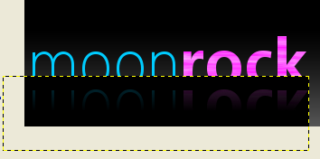
Moon Rock came to us and wanted a “cliché web 2.0 design”. Basically that means they were asking for gradients, mirrored surfaces, reflections, and shiny or glossy images. To begin the logo, I created a gradient background. Select one color of gray as the foreground and another as the background. Then choose the gradient tool and drag it vertically from the top of the image to the bottom. Play around with this for a little to get a feel for the tool. Once that was completed, I used the text tool to write moon in blue and then rock in pink. I then chose the dodge/burn tool to alternately dodge and burn the pink letters:

Once I was certain the text was how I wanted, I stacked the two text layers to become a single layer, making them easier to work with. To mirror the text, you simply Duplicate Layer and then Flip Vertically. Position it below the original text. Now, under the transparency menu, Add Alpha Channel to the layer. This will allow us to make use of transparency. If the option was grayed out, then your layer already has an alpha channel, so you can just continue to the next step. The final step is to create another gradient effect. We want to use the gradient to hide the portion of the reflection we don’t want to see. I changed the foreground to black. Most importantly, you must click the picture of the gradient you’re creating in the gradient tool options and select “FG to Transparent”. Now drag the gradient tool up vertically over the text. This will hide most of the text with a black gradient:

Since we don’t want the black to show in the final logo, select Color to Alpha and choose black. Now the black will have disappeared leaving you with a finished reflection effect:

In the Lumidant logo on the Lumidant homepage, the lighthouse searchlight or spotlight was also created using gradient effects. To create a spotlight, first create a new layer. This is important because we will duplicate the layer later and only want the spotlight itself duplicated. Draw the outline of the light you’d like to create by using the paths tool. I created the light by drawing a long triangle. After you have drawn the third point and would like to connect back to the first, hold Ctrl and click on the first point. This will close the shape. Then hold Ctrl, click on the short side of the triangle, and drag it outwards. This will round the end of the light. Turn the shape into a selection by clicking “Selection from Path”:

Now, we get to use the gradient tool again. Having created the spotlight-shaped selection, we can draw inside the selection and nothing outside of it will be affected. Select white and “FG to Transparent”. Drag the gradient tool from the point of the triangle to the end of the rounded section. Now Duplicate Layer. Add a 4px Gaussian Blur filter to one of the layers. In the “Layers, Channels, Paths, Undo” menu bar (referred to as a dialog by GIMP), select the layer that you blurred and move the opacity down to 80. Now choose the original spotlight layer and move the opacity down to 20. Hooray! You’ve just created an awesome looking spotlight.


Some screenshots would be great for this tutorial 😉
I like it
let’s have more Gimp and paintdotnet tutorials and LESS
PhotoShop please
Yours
elwaltura
Quite right Kasra. I’ve added a few at your suggestion. Let me know if anything’s not clear.
Thanks, its must easier to follow now.
You really don’t explain the effects I’m seeing in the shots. I really like what you did with the glowing “o” in “rock”, but I can’t duplicate it from the tutorial.
Hi Jeff,
This tutorial was only meant to show you how to create the mirrored letters in the MoonRockMedia.com logo and the spotlight in the Lumidant logo. But I’ll let you in on how I created the moon anyway ;o) I took a picture of the moon, used the color to alpha command I mentioned earlier to turn the black sky transparent. Then I resized the layer to make the moon the same size as the O and positioned that layer on top of the moon.
-Ben
OK. I got a little closer, but your still looks a lot cooler. The “Add Alpha Channel” option under layer | transparency doesn’t seem to ever by enabled for me using Gimp 2.4.2, but I used other techniques to get a similar effect.
Thanks!
If the “Add Alpha Channel” option is not enabled then it probably means that there’s already an alpha channel for that layer. Just skip to the next step in the tutorial and you should be fine.
Am I missing something? In regards to the Moon Rock logo. If, for the 2nd gradient, you use a gradient going from black to transparent and then you color to alpha with black won’t you have effectively created a completely transparent gradient?
Hi Tim,
I see why there could be some confusion.
See the picture in the tutorial with the yellow dotted line? That is what the image looks like after the gradient has been drawn on. Now here’s the important part: When you change the black to transparent in that layer, you are affecting the entire layer and not just the gradient you have drawn. So when you make the layer transparent, you also are making the parts of the letters you blacked out transparent as well.
Now if what you were instead asking me, is whether this is a dumb way of doing it and whether an easier way might exist, then please let me know because it’s very possible that there is. This was my first time ever using GIMP and I was in a bit of a hurry, so I could see needing two steps here a bit fishy if it can be done in only one.
Thanks! – Ben
Ben,
Ok, I see what you’r doing. As to the second bit, I have no better way to do it. I’m a complete design novice and am just learning my way around GIMP. Thanks for the quick reply.
Tim
Seria melhor se você explicasse passo a passo.
Oi Guilherme,
Eu tenho tentado ser detalhadas. Porções que eu preciso para adicionar mais passos para?
I never understood how to really apply the Gradients until I read this. Now I’m just geeking out with the Blend tool. Thanks a ton!
got it, thanks! cool!
Oh, one more thing, for the moon effect all you have to do is use the “SuperNova ” filter uner lights and shadow…